Understanding Web Design and Its Role in Web Development
Web design shapes the visual identity and user experience of your website. It’s the art of crafting digital interfaces that captivate visitors and guide them through your content seamlessly.
Key Components of Web Design:
- Visual aesthetics (colors, typography, imagery)
- Layout and composition
- User interface (UI) elements
- Content presentation
- Brand identity integration
A prime example of effective web design can be seen in the Manorafon Farm Park project, where these principles were applied to create an engaging online presence.
Web design differs significantly from web development, though they work hand in hand. Think of web design as the architect’s blueprint, while web development is the actual construction process.
Web Design vs Web Development:
- Design focuses on appearance and user experience
- Development handles functionality and technical implementation
- Designers create mockups and prototypes
- Developers write code and build features
Your website’s success relies on the harmonious blend of both disciplines. Web designers craft the visual elements that attract users, whilst developers ensure everything works flawlessly behind the scenes.
To further enhance your website’s functionality, services like WordPress hosting packages can be beneficial. Additionally, incorporating video content into your site can significantly improve user engagement.
Moreover, a well-executed SEO strategy is crucial for increasing your website’s visibility. Implementing a visibility SEO package can help achieve this goal.
Key Principles to Create Visually Appealing Websites

Creating a visually appealing website requires mastery of six fundamental design principles that work together to capture and maintain user attention. However, it’s also essential to integrate these design principles with effective SEO strategies to ensure your website reaches its intended audience.
1. Balance
Balance brings stability and structure to your website’s layout. You can achieve this through:
- Symmetrical balance: Placing elements of equal weight on both sides of the centre line
- Asymmetrical balance: Using different elements that carry similar visual weight
- Example: A homepage with a large hero image on one side balanced by multiple smaller content blocks on the other
2. Contrast
Contrast helps guide users through your content by creating visual interest and highlighting key elements:
- Use contrasting colours for text and background (e.g., black text on a white background)
- Vary font sizes between headings and body text
- Mix different textures or patterns to create depth
- Example: Using a bold, large heading against smaller, lighter body text
3. Emphasis
Emphasis directs attention to specific elements on your page:
- Strategic use of colour to highlight call-to-action buttons
- Increased size for important content
- White space to isolate key elements
- Example: An orange ‘Buy Now’ button standing out against a neutral colour scheme
4. Movement
Movement guides visitors through your content in a natural flow:
- Directional cues through arrows or pointing elements
- Leading lines created by shapes or patterns
- Z-pattern layout for text-heavy pages
- Example: Using a curved line to lead eyes from the header to the main content
5. Rhythm
Rhythm creates visual patterns that make your design more engaging:
- Regular rhythm: Through consistent spacing
- Progressive rhythm: By gradually increasing or decreasing element sizes
- Random rhythm: For dynamic layouts
- Example: A portfolio page with images arranged in a consistent grid pattern
6. Hierarchy
Hierarchy establishes the order of importance for your content:
- Primary elements: Main headlines and key visuals
- Secondary elements: Subheadings and supporting images
- Tertiary elements: Body text and additional details
- Example: A news website with a large featured story, medium-sized secondary stories, and smaller related articles
These principles work together to create a cohesive design that not only looks professional but also effectively communicates your message.
Enhancing User Experience (UX) Through Effective Web Design Strategies
User Experience (UX) shapes how visitors interact with and perceive your website. It encompasses every aspect of user interaction, from the initial landing to the final conversion. A well-crafted UX strategy transforms casual browsers into engaged users and loyal customers.
Key Elements of Effective UX Design
1. Usability
- Intuitive interface design
- Clear navigation paths
- Quick load times
- Mobile responsiveness
- Error-free functionality
2. Findability
- Strategic content placement
- Search functionality
- Logical information hierarchy
- Clear categorisation
- Breadcrumb navigation
3. Credibility
- Professional design aesthetics
- Updated content
- Security certificates
- Social proof elements
- Contact information visibility
4. Desirability
- Engaging visual elements
- Brand consistency
- Emotional connection
- Personalised experiences
- Interactive features
Practical UX Implementation Strategies
- User Research: Conduct surveys, analyse user behaviour, and create personas
- Testing and Optimisation: A/B testing, heat mapping, user feedback, and performance monitoring
Your website’s success heavily depends on how users experience your digital space. By implementing these UX strategies, you create an environment where users feel comfortable, confident, and engaged.
Implementing Intuitive Navigation Systems for Seamless User Journey
Navigation serves as your website’s roadmap, guiding visitors to their desired destinations. A well-structured navigation system reduces bounce rates and increases user satisfaction by making content easily accessible.
Essential Navigation Components:
- Main Navigation Menu – Positioned at the top, containing primary website sections
- Sticky Navigation – Remains visible as users scroll
- Dropdown Menus – Organises related content hierarchically
Advanced Navigation Features:
- Breadcrumbs: Shows users their current location and improves navigation
- Search Functionality: Provides direct access to specific content
Mobile Navigation Considerations:
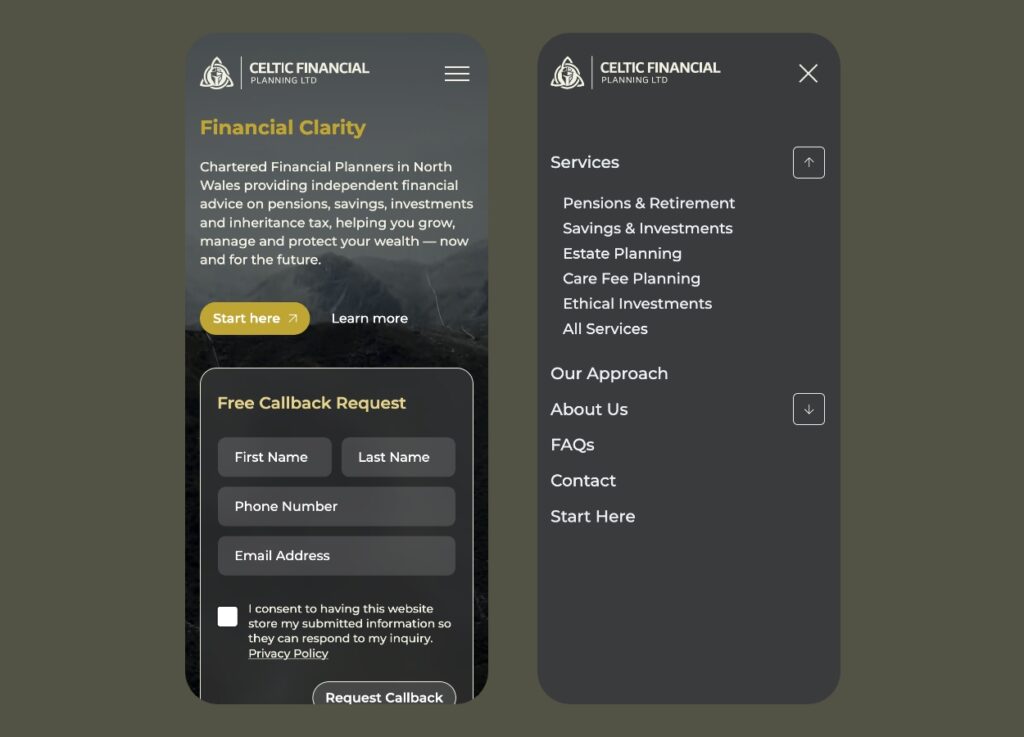
- Hamburger Menu: Saves space and expands to reveal navigation options
Testing different navigation styles across devices ensures optimal usability.
Responsive vs. Adaptive Design: Choosing the Right Approach for Your Website
Responsive Design: Adapts fluidly to different screen sizes using flexible grids. Best for scalability and SEO.
Adaptive Design: Uses predefined layouts tailored for specific devices. Ideal for targeted user experiences.
Choosing the Right Approach:
- Responsive design is best for cost-effective, scalable solutions
- Adaptive design suits sites needing device-specific experiences
The Impact of Quality Web Design Services on Online Success
Quality web design services drive business growth through:
- Higher conversion rates
- Enhanced brand recognition
- Competitive advantage
- Cost-effective digital marketing
- Increased customer trust
Investing in professional web design isn’t just about aesthetics—it’s about strategic growth and long-term success.