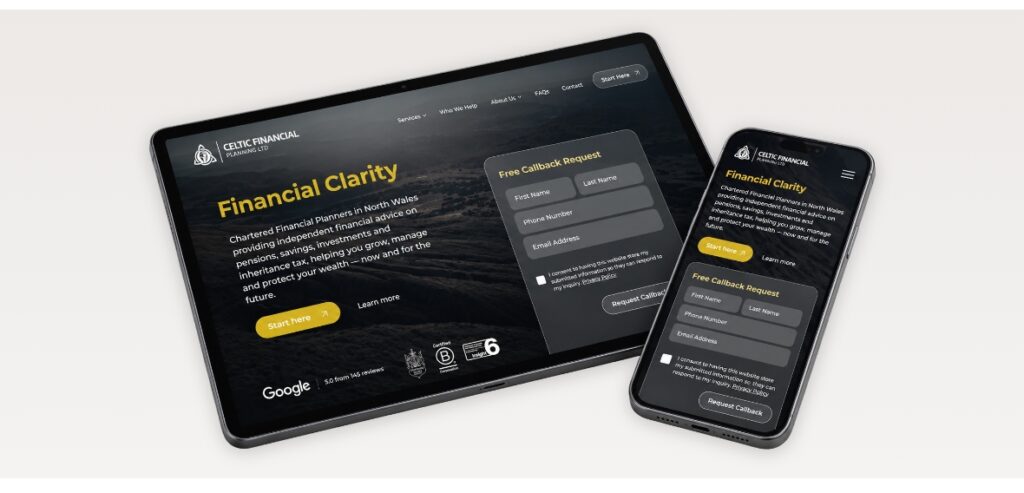
Online retail has become one of the most competitive spaces a business can operate in, and the gap between stores that convert well and stores that struggle rarely comes down to product or pricing alone. The way a website is designed shapes how visitors perceive the brand, how confidently they move toward checkout, and whether they complete the purchase or abandon halfway through. Small design oversights that seem harmless in isolation often add up to significant revenue loss across thousands of monthly sessions. Recognising where these issues sit is the first step toward fixing them, and most underperforming stores share the same E-commerce website design weaknesses that quietly cost them sales every day.
Why Design Decisions Decide Whether Visitors Buy or Leave
Shoppers form trust judgments on a product page within seconds. Layout, hierarchy, image quality, and how friction shows up at the moment of purchase all influence whether a session ends in revenue or a closed tab. A store can have excellent products and competitive pricing, and still convert poorly because the interface introduces doubt at exactly the wrong moments.
What makes this difficult for store owners is that the problems rarely announce themselves. Traffic still arrives, the cart still works, and the analytics dashboard does not flag a design issue the way it flags a broken payment gateway. The leakage happens quietly across thousands of sessions.
The 10 Most Damaging E-Commerce Website Design Mistakes We See in Audits
Across audits we conduct for retail clients, the same patterns keep surfacing. The mistakes below cause the largest measurable drop in conversion rate when corrected, and most stores carry several of them at once:
1. Hero Sections That Say Nothing Useful
Too many stores open with a vague lifestyle banner and a slogan that could belong to any brand in the category. The visitor learns nothing about what is sold, why it matters, or what to do next. A strong e-commerce website design uses the top of the homepage to communicate category, value proposition, and a clear entry point into the catalogue within the first viewport.
2. Product Photography That Undermines Price Point
A premium product photographed against a cluttered background with inconsistent lighting tells the visitor the brand is not premium. Image quality is the single biggest visual trust signal a store has. When the photography looks like it was taken on a phone in a back office, the price point loses its justification, regardless of how good the product actually is.
3. Mobile Layouts Treated as an Afterthought
Mobile now drives the majority of retail traffic across most UK verticals, yet many stores still ship mobile experiences that were clearly designed on a desktop and squeezed down afterwards. Buttons sit too close together, product images crop awkwardly, and the cart icon disappears behind a hamburger menu. A properly executed e-commerce website design treats mobile as the primary canvas rather than the leftover view.
4. Search That Cannot Find Products in Its Own Catalogue
Visitors who use site search convert at significantly higher rates than those who browse, which makes a weak search function one of the most expensive failures a store can carry. Misspellings return zero results, synonyms are not recognised, and filters do not narrow correctly. For stores with more than fifty SKUs, this is no longer optional functionality.
5. Product Pages That Hide the Information Buyers Actually Need
Dimensions, materials, fit notes, delivery times, and return terms are the details that close a sale. When these sit behind tabs, get buried below the fold, or appear in faint grey text that scrolls past unread, hesitation builds. The product page should anticipate every question a buyer will ask in the next ninety seconds and answer it without forcing a click.
6. Trust Signals That Are Either Missing or Performative
Generic badges that nobody recognises do not build credibility. Real trust signals are independent review platforms, named customer photographs, clear returns policies written in plain language, and visible business information. Performative trust elements pasted across the footer often signal the opposite of what they intend.
7. Check out Flows That Punish the Customer for Buying
Forced account creation, unexpected delivery costs revealed only at the final step, address forms that reject valid postcodes, and payment options that exclude the wallet a customer actually uses. These are the moments that turn a confirmed buyer into an abandoned cart, and they account for a large portion of the revenue most stores leave behind.
8. Navigation That Hides the Catalogue
A menu structure built around internal team logic rather than how customers actually shop. Categories are named after supplier groupings, top-level items that lead to dead-end landing pages, and no clear path from the homepage to a relevant product set. The visitor should be three clicks or fewer from any product they came to find.
9. Page Speed Treated as a Developer Problem Rather Than a Design Problem
Heavy hero videos, uncompressed gallery images, third-party scripts loaded on every page, and chat widgets that block rendering. Speed is a design decision before it is a technical one, because every visual element added to the page is also a performance cost. Slow stores lose customers before the page finishes loading.
10. No Clear Visual Hierarchy on Category Pages
Category pages that show every product at the same visual weight force the visitor to do all the sorting themselves. Bestsellers, new arrivals, and sale items deserve visual treatment that pulls the eye. A flat grid with no signposting is one of the most common e-commerce website design weaknesses, and one of the easiest to correct.
How Do You Know Which Mistakes Are Costing You the Most Right Now?
The starting points we recommend looking at:
- Heatmap data showing where visitors click, scroll, and stall on key pages
- Session recordings that reveal the actual moment users hesitate or leave
- Pages with high entry rates paired with high exit rates
- Checkout abandonment data segmented by device type
- Funnel drop-off points between product view, add to cart, and purchase
An Experienced E-Commerce Website Developer Can Change the Outcome
An experienced e-commerce website developer brings the diagnostic eye that internal teams often lose after working on the same store for years. At Designweb, we have spent more than two decades building and refining online stores for businesses across North Wales and the wider UK, working in WordPress, WooCommerce, Shopify, and bespoke platforms depending on what suits the business. Our team handles the design, development, and ongoing optimisation under one roof, which means strategy and execution stay aligned rather than getting handed off and diluted.
What Working with a Local E-Commerce Web Design Agency in North Wales Actually Looks Like
Working with an e-commerce web design agency in North Wales gives store owners something the larger London or Manchester studios rarely offer, which is direct access to the people doing the work and a relationship that continues past launch. Our team meets clients face to face, learns the business properly, and stays involved through the growth phases rather than disappearing once the site goes live. That continuity is often what determines whether a store keeps improving or starts drifting back into the same mistakes that prompted the rebuild in the first place.
Fix the E-Commerce Website Design Issues Draining Your Revenue
If your store is converting below where it should be, the answer is usually sitting inside the e-commerce website design itself. Contact our team for a focused review of your store, and we will identify which of these mistakes are costing you the most and what it takes to fix them properly.